Every December, we get to read all the interesting articles about what to expect in the coming year. Food trends, flavor profiles, equipment innovations to look for, and even the best new tabletop -- all of these are part of our industry's canon of content as we enter the new year. There's one trend, though, that always stands out to us here at BauscherHepp.
The Pantone Color of the Year.
Pantone colors are a standardized color-matching system widely used in various industries, including graphic design, printing, fashion, and even foodservice. Developed by the Pantone company, this system assigns unique codes to each color, making it easier for designers and manufacturers to communicate and reproduce specific shades accurately. The colors are essential in brand identity, ensuring consistency across different media and materials.
We all know there are color trends each and every year, and this is largely due to Pantone. The Pantone Color of the Year, an annual announcement, influences design trends and reflects current cultural and social sentiments. Embraced by creatives worldwide, Pantone colors are integral to the visual language of modern design, offering a comprehensive and universally understood palette. That palette often makes it to the plate and is celebrated on the tabletop within the foodservice industry.
A Look Back at Recent Pantone History
Colors are critical to creating an ambiance for diners, developing an emotional connection that can serve as the direction for an entire meal. As the purveyor of high-end dinnerware, glassware, and flatware, it's our job to stay on top of the tabletop trends, especially the tones that are trending across the foodservice industry. Over the past few years, we've highlighted some of the Pantone Colors of the Year, even finding them in our own collections. Here's a brief look back at what the past few years have shown us in the colorful world of Pantone.
2023: Viva Magenta
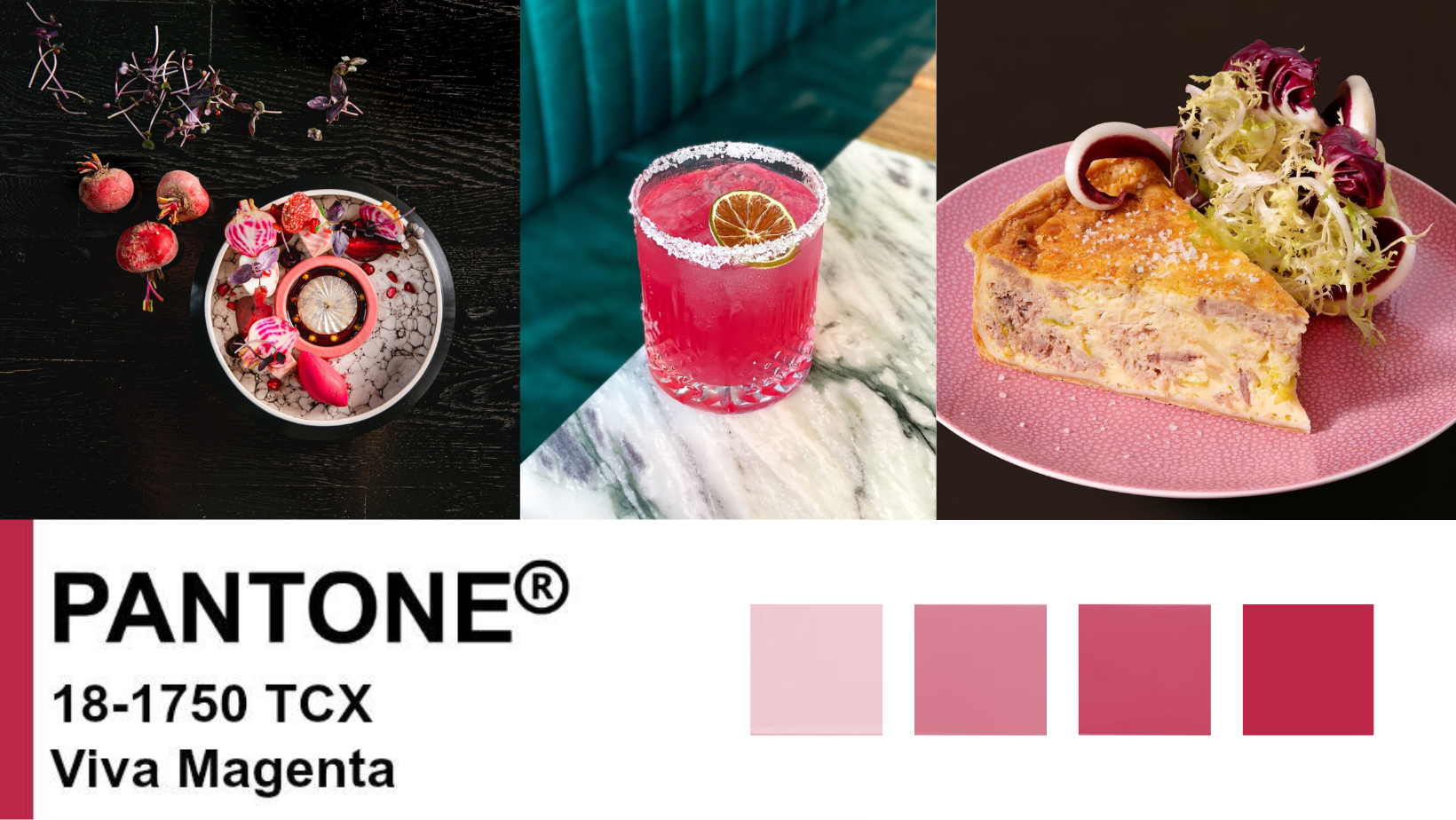
The Pantone Color Institute introduced Viva Magenta as its 2023 Color of the Year, inviting us into the Magentaverse. Described by Pantone Vice President Laurie Pressman as a color exuding joy, optimism, and fearlessness in design, Viva Magenta stood out as a lively and versatile shade that complements both warm and cool colors. Inspired by the cochineal beetle and the vibrant carmine it produces, this hue was more than just a trendy pink—it symbolized a celebration of life and encouraged introspection on personal strength and appreciation for nature's inspiration. Perfect for festivities like Easter and Mother's Day, Viva Magenta was a departure from typical pale pinks making for a more vibrant experience.
2021: A Year of Two Colors, Ultimate Gray and Illuminating
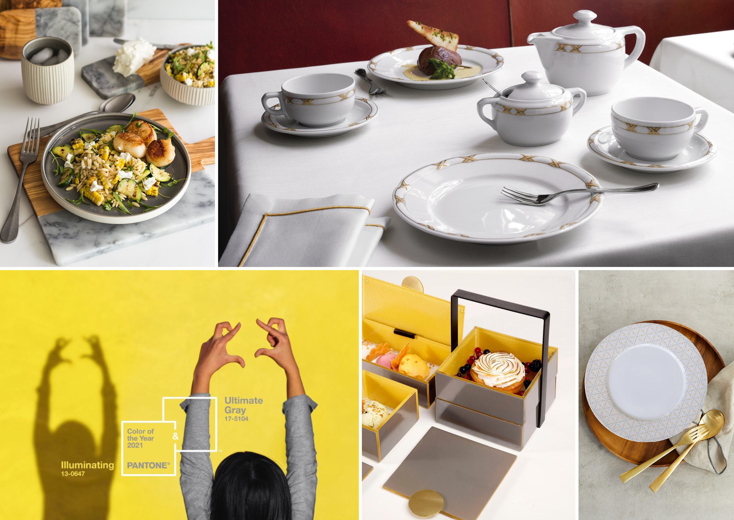
In 2021, Pantone ushered in the new year with a unique choice, presenting not one but two Colors of the Year: Ultimate Gray, a warm and light gray, and Illuminating, a sunny lemon yellow. The Pantone Color Institute, known for its annual selections influencing industries like fashion and design, made this decision based on months of cultural climate analysis. Executive Director Leatrice Eiseman emphasized the symbolism, stating that the pairing of enduring gray with vibrant yellow signified a message of positivity, blending resilience and hope. As these colors were released in the midst of the COVID pandemic, an event that hit the foodservice industry particularly hard, the color pairing suggested collective strength and optimism. The suggestion to incorporate these shades into table settings from various collections reflected a desire to spread hope and celebrate the resilience seen in the community.
2020: Classic Blue
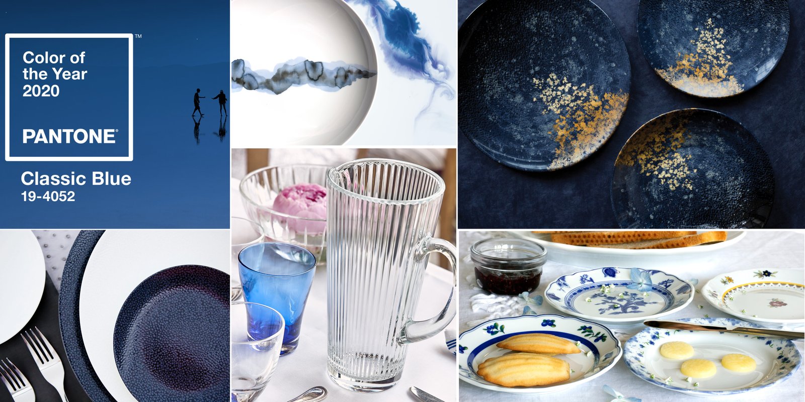
In 2020, the Pantone Color Institute unveiled its Color of the Year: Classic Blue, a cool and calming shade reminiscent of the vast twilit sky. What they didn't realize was the world would soon be engulfed by the global "blues" as COVID lockdowns forced many into isolation. Laurie Pressman, Pantone's Vice President, elucidated the choice, emphasizing that Classic Blue was a color anticipating future developments and setting a hopeful tone for the new era. It was a statement that soon gained a deeper meaning.
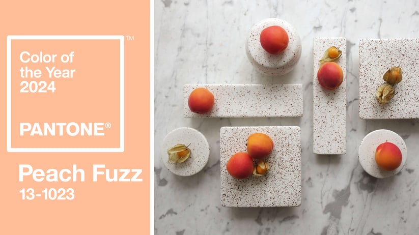
Unveiling the 2023 Color of the Year: Peach Fuzz
The Pantone Color of the Year for 2024, Peach Fuzz embodies a velvety and gentle peach tone. With an all-embracing spirit that enriches the mind, body, and soul, this hue reflects a commitment to nurturing ourselves and others. Described as radiant with warmth and modern elegance, Peach Fuzz effortlessly bridges the youthful with the timeless, offering a tactile embrace that symbolizes compassion. Leatrice Eiseman, the Executive Director of the Pantone Color Institute, emphasizes the selection's significance in capturing the essence of our collective yearning for connection and the color's ability to convey a sense of closeness and warmth.
Consider these recent posts on Instagram that highlight the importance, value, and allure of Peach Fuzz:
Do these colors translate to the tabletop? Check out our collections and catalogs to find out how to make Pantone a part of your everyday plating.