Color plays a huge role in our dining experiences.
Experiments have shown that contrasting colors on a plate can lead diners to taking greater quantities of food in a buffet line. Colors are known to impact our thoughts about food; reds, for instance, evoke flavors of strawberry. And even lighting that changes the colors of foods that diners were enjoying a few minutes before can turn those foods into off-putting dishes.
The bottom line is color matters, and chefs need to consider this fact -- and take advantage of it -- when developing plating techniques.
As we've detailed many times before, the first step in eating is almost always seeing. First impressions make a difference, and if dull, beige foods are served on top of muted beige dinnerware, chefs will lose the opportunity to dazzle on first glance. They'll pass on the chance to set expectations with guests as to what the next hour or two will hold.
Traditionally, we've mostly used white for the same reason a blank canvas starts off as white. Yes, many artists will block of their workspaces with different background colors. But more on colors in a bit.
White has been the color of choice because pretty much every dish or type of food looks good on white. Ingredients look more appealing, vibrant, and are more apt to pop off the plate. Because we've used it for so long, though, white can also become boring. Other options have emerged that integrate aspects of nature, the elements, or even complete color swatches that will accentuate certain dishes.
Here's a quick list of colorful options to consider and why you should consider them:
BLACKS AND BROWNS - With new collections like Sienna and Sandstone, chefs should consider light brown, beige, and off-white foods. This is an easy way to take bland-looking ingredients and make them pop off the plate.
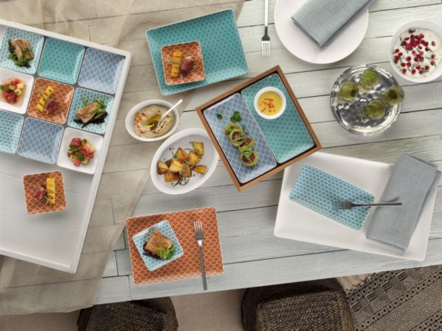
BLUES, GREENS AND GRAYS - If you have bright, vibrant food colors like yellows, oranges, and reds -- perhaps mixed in with some white -- blues and grays provide an appetizing contrast.
YELLOWS, PINKS AND WARMER HUES - Green foods like salads, spinach, or even herbal accents like chives can really look good on plates with warmer hues. The contrast is subtle enough to be appealing while not being overtly contrasting like dark reds and dark greens.
Yes, colors are important. They can help lead our eyes in certain directions and even alter our experience of eating. BauscherHepp and our collection of fine dinnerware brands are aware of these facts, and as a result, have led us to create some of the most interesting décor patterns on the market.
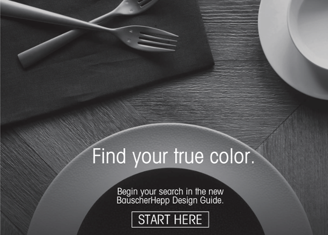
Would you like to learn more about the colored dinnerware options available to chefs today?
Be sure to download our latest BauscherHepp Design Guide for inspiration.