As we highlighted over the last year or so -- and in a recent piece we published recapping the top tabletop trends of 2018 -- the direction of tabletop design and décor is heading to a more organic place in its philosophy. Diners, in particular, are enjoying menus rooted in Earth-bound options, while operators are looking to accentuate natural elements in their designs and on top of their tables.
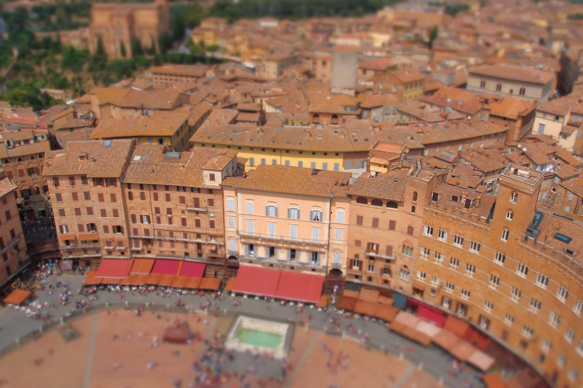
So what's all of this have to do with an overhead picture of an Italian piazza? It's all in the name, but more on that in a minute.
A Return to the Earth
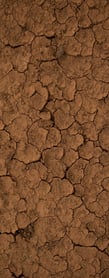
 Part of the organic, nature-inspired trend in tabletop has been a return to warm, earthy tones. Eye-catching browns and deep red-oranges are coming to the forefront, but sometimes they need a little assistance to make it there. That's where contrast can help.
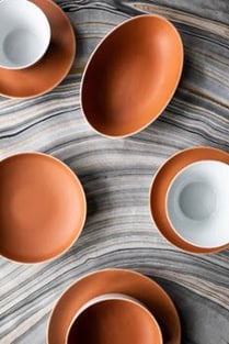
As with anything related to color, setting up one hue against another can help make both colors pop. A matte, terracotta orange, for example, works really well when paired with a smooth, glossy white. A clay-like plate looks even better with a shiny bowl on top of it.
What's in a Name?
 Sienna is a word we associate with color. It's an earth pigment that's yellowish in its raw state and more reddish-brown when it's burnt. Hence the famous colors of Raw Sienna and Burnt Sienna. These hues are found in pastels, in oil paints, and yes, even in tabletop.
This famous color comes from the earth. In fact, it derives its name from the Italian terra di Siena, which means the earth of Siena, the Italian city where the natural clays and soils were turned into pigments. The buildings in this famous Tuscan city are also built with the same materials, and the famous piazza posted above reflects some of these warm, earthy tones.
This was the inspiration for Tafelstern's new Sienna collection, a porcelain pairing that brings together the colors of burnt earth with the process of burnt earth. It's a complete reflection of matte meets gloss, raw versus refined, warmth paired with smoothness, and earth contrasted by bright white.


